5 Vehicle Graphic Pitfalls to Avoid
Anyone who wants a vehicle graphic will want it to look amazing. Unfortunately, not everyone is familiar with graphic design and what makes a good vehicle graphic. Vehicle graphics are meant to positively enhance the appearance of your vehicle or bring more attention to your business. Not knowing how to create a good vehicle graphic can result in a messy, cluttered wrap that doesn’t get the message across.
To ensure your vehicle wrap is amazing, avoid these 5 common graphic pitfalls.
1. Hard to Read Font
If you’re getting your vehicle wrapped for business purposes, you want to make sure that everyone who sees the wrap can read it and understand it. If they can’t read what’s on the wrap it will not help you or your business grow.
The best option is to use a font that is easy to read from a long distance. These can be fonts that are blocky, similar to what you would see on highway signs and billboards. You don’t want to use a cursive font or one that can be difficult to read from a distance. It’s important to make the font big enough that everyone can see it.
2. Too Much Text
Using too much text is another big mistake. Of course, it’s important to have your business name and phone number on the vehicle, but you don’t want to have an overload of information on the vehicle as the information can get lost.
Roads are already areas full of information and distractions, especially in high traffic areas like cities and highways. You want people to be able to read your vehicle information in about three seconds of spotting it. This is why it’s so important to keep your wrap simple and introduce a message or logo that’s easy for potential customers to understand.
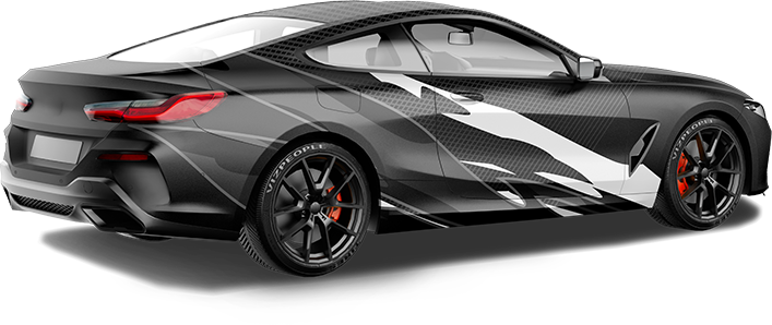
3. Too Many Vehicle Graphics
When it comes to graphics, people will often think that bigger is better since more people will see it. This is far from the truth. Graphics should be used to help emphasize important details and add visual interest, not overwhelm the viewer with too much color or details.
You want the message to be seen, just don’t go overboard. Using too many vehicle graphics can make your message seem desperate and overkill. If you want people to remember your graphic, putting too much will have the opposite effect.
4. Bad Placement
Where you put your graphics will depend on what type of vehicle they are being put on. A large box truck or van could benefit from having a vehicle graphic on the side or back. Smaller vehicles or sedans will benefit from graphics on the back window or tailgate.
5. Vehicle Graphic with no Call-to-Action
A call to action is a must. People need to know what to do once they’ve seen your graphic. Something like “Call Now” or “Visit Our Website” are examples of calls to action. Asking for a response will encourage those who see your graphic to act on it. No call to action eliminates the reason for getting a vehicle graphic in the first place.
Vehicle Graphics Done Right
If you need a new vehicle graphic installed or you need help planning your vehicle graphic, GNS Wraps is here to help. Our team of graphic designers and car wrap professionals will know exactly what to do to help you. Contact us today to get a vehicle wrap that works.

